
1.
display:grid2.
grid-template-columns: 100px 100px 100px  //指定每列的宽度
grid-template-rows: 100px 100px 100px    //指定每行的宽度
3.
column-gap: 24px    //列间距
row-gap: 24px    //行间距
gap: 24px    //都设置
4.grid-template-areas用法
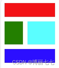
<!DOCTYPE html>
<html lang="en">
<head><meta charset="UTF-8"><meta name="viewport" content="width=device-width, initial-scale=1.0"><title>Document</title>
</head>
<style>.container{width: 100px;display: grid;grid-template-areas: "header header header""sidebar content content""footer footer footer";gap: 10px;}header{width: 1fr; height: 30px;grid-area: header;background-color: red;}main{width: 60px; height: 50px;grid-area: content;background-color: aqua;}aside{width: 40px; height: 50px;grid-area: sidebar;background-color: green;}footer{width: 1fr; height: 30px;grid-area: footer;background-color: blue;}
</style>
<body><div class="container"><header></header><aside></aside><main></main><footer></footer></div>
</body>
</html>
效果
5.
align和justify和flex一样
6.
grid特有的浮动单位:fr
长度为 当前fr / 总fr


)
)


![[C++]内存管理:串顺序存储的内存回收](http://pic.xiahunao.cn/yaotu/[C++]内存管理:串顺序存储的内存回收)

:ArkUI 首页仪表盘搭建)