web前端——伸缩盒模型

15.伸缩盒模型
1.伸缩盒模型简介
2009 年,W3C 提出了一种新的盒子模型 -- Flexible box (伸缩盒模型,又称: 弹性盒子)。
。它可以轻松的控制:元素分布方式、元素对齐方式、元素视觉顺序 ......
。截止目前,除了在部分IE 浏览器不支持,其他浏览器均已全部支持。
。伸缩盒模型的出现,逐渐演变出了一套新的布局方案-- flex 布局
小贴士:
传统布局是指: 基于传统盒状模型,主要靠: display 属性+ position 属性+ float 属性。
flex 布局目前在移动端应用比较广泛,因为传统布局不能很好的呈现在移动设备上。
伸缩盒模型容器与项目
伸缩项目:伸缩客器所有子元素自动成为了:伸缩项日。
1仅伸缩容器的子元素成为了伸缩项日,孙子元案、重孙子元案等后代,不是伸缩项目。
2.无论原来是哪种元案(块、行内块、行内) ,一旦成为了体缩项目,全都会”块状化”.
在开发者工具中computed中可以看到每个元素的属性
伸缩盒里的伸缩项目是按主轴的方向排列的。
/*伸缩盒模型相关属性-start */
/*将该元素变为了伸缩容器 (开启了flex布局) */
display: flex;
/*调整主轴方向,水平从左到右,默认 */
/* flex-direction: row; */
/*调整主轴方向,水平从右到左 */
/* flex-direction: row-reverse; */
/* 调整主轴方向,垂直从上到下 */
/* flex-direction: column; */
/* 调整主轴方向,垂直从下到上 */
flex-direction: column-reverse;
主轴与侧轴
主轴: 伸缩项目沿着主轴排列,主轴默认是水平的,默认方向是:从左到右(左边是起点,右边是终点)。
与主轴垂真的就是侧轴,侧轴默认是垂直的,默认方向是:从上到下 (上边是起点,下边是终点)。
主轴的方向
属性名:flex-direction:row;
常用值:
row 主轴方向水平方向从左到右(默认)
row-reverse 主轴方向水平方向从左到右
column 主轴方向垂直从上到下
column-reverse 主轴方向垂直从下到上
只能改变主轴的方向,主轴的方向默认和侧轴垂直,只要改变了主轴的方向,侧轴的方向也随之改变。
主轴换行方式
属性名:flex-wrap
常用值如下:
- nowrap:默认值,不换行
- wrap:自动换行,伸缩容器不够自动换行
- wrap-reverse:反向换行
伸缩盒模型会根据剩余的空间和子元素的个数等情况安排子元素的分布位置。
<!DOCTYPE html>
<head><meta charset="UTF-8"><title>高度塌陷相关学习</title><style>/*body为最外面的父容器*/body{display:flex;}.outer{width:600px;height:600px;background-color:#888;/*将该元素变为了伸缩容器(开启了flex布局)*//*inline-flex把div都变成伸缩容器和行内块这两个作用*/display:flex;flex-direction: row-reverse;flex:1;} /*只有直接的子容器才是伸缩项目*/.inner{width:200px;height:200px;background-color:skyblue;border:1px solid black;box-sizing:border-box;float:left;}</style>
</head>
<body><div class="outer"><div class="inner">1</div><div class="inner">2</div><div class="inner">3</div> <div class="inner">4</div><div class="inner">5</div><div class="inner">6</div><div class="inner">7</div><div class="inner">8</div><div class="inner">9</div> </div></body>
</html>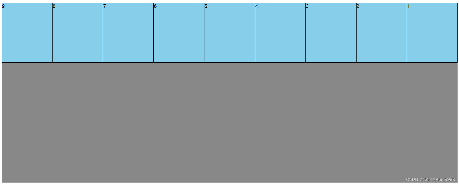
自动换行,伸缩容器不够自动换行
.outer{width:600px;height:600px;background-color:#888;/*将该元素变为了伸缩容器(开启了flex布局)*//*inline-flex把div都变成伸缩容器和行内块这两个作用*/display:flex;flex-direction: row-reverse;flex:1;flex-wrap:wrap;} 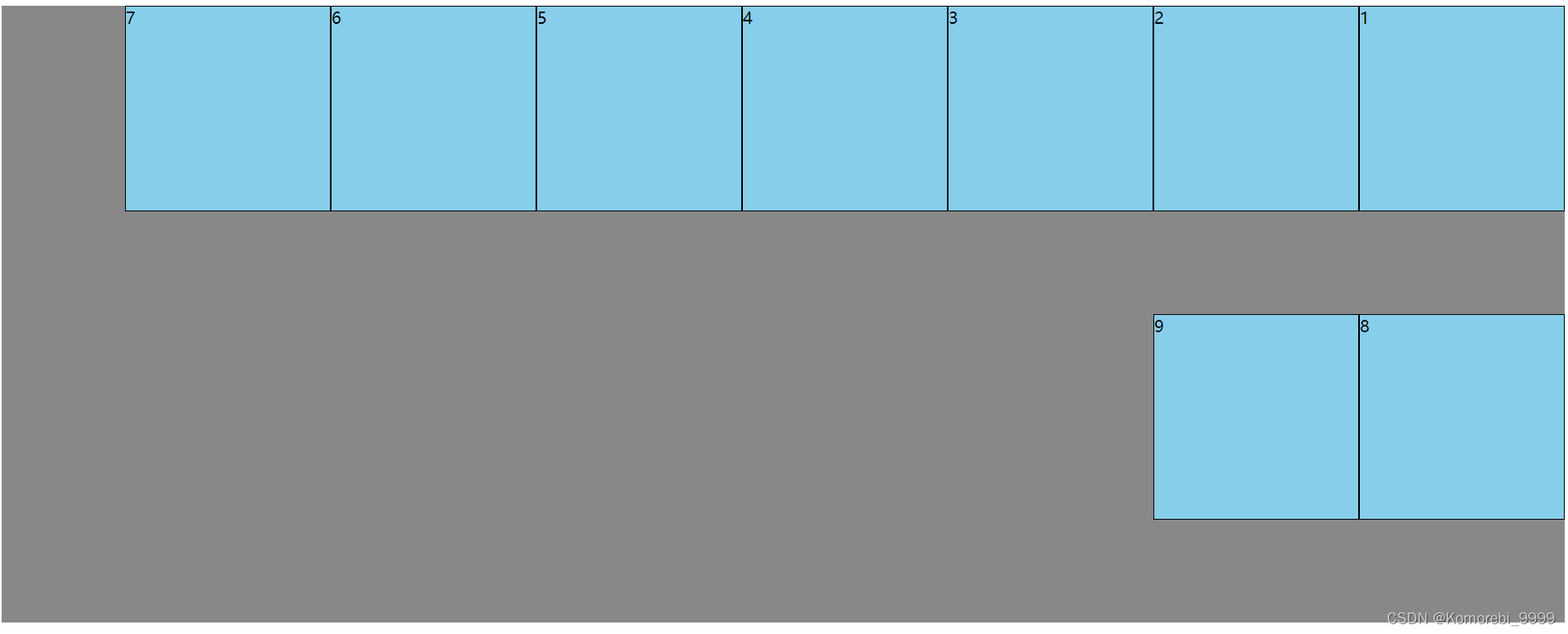 反向换行:wrap-reverse;
.outer{width:600px;height:600px;background-color:#888;/*将该元素变为了伸缩容器(开启了flex布局)*//*inline-flex把div都变成伸缩容器和行内块这两个作用*/display:flex;flex-direction: row-reverse;flex:1;flex-wrap:wrap-reverse;} 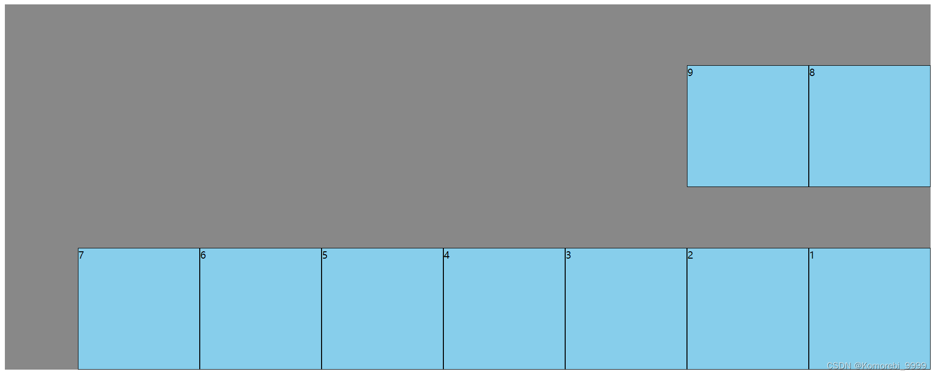
伸缩盒模型flex-flow(不建议使用,最好分开写)
flex-flow是一个复合属性,复合了flex-direction和flex-wrap两个属性,值没有顺序要求
flex-flow:row wrap;
伸缩盒模型——主轴对齐方式
属性名:justify-content
属性值:
flex-start 主轴的起始位置
flex-end 主轴的结束位置
center 中间对齐
space-around 项目均匀地分布在一行中,项目与项目之间的距离,是项目距边缘的二倍
space-between 项目均匀地分布在一行中,项目与项目之间的距离是相等的,项目据边缘没有距离
space-evenly 项目均匀地分布在一行中
justify-content: center;
<!DOCTYPE html>
<head><meta charset="UTF-8"><title>高度塌陷相关学习</title><style>/*body为最外面的父容器*/body{display:flex;}.outer{width:600px;height:600px;background-color:#888;/*将该元素变为了伸缩容器(开启了flex布局)*//*inline-flex把div都变成伸缩容器和行内块这两个作用*/display:flex;flex-direction: row-reverse;flex:1;flex-wrap:wrap-reverse;justify-content: center;} /*只有直接的子容器才是伸缩项目*/.inner{width:200px;height:200px;background-color:skyblue;border:1px solid black;box-sizing:border-box;float:left;}</style>
</head>
<body><div class="outer"><div class="inner">1</div><div class="inner">2</div><div class="inner">3</div> <div class="inner">4</div></div></body>
</html>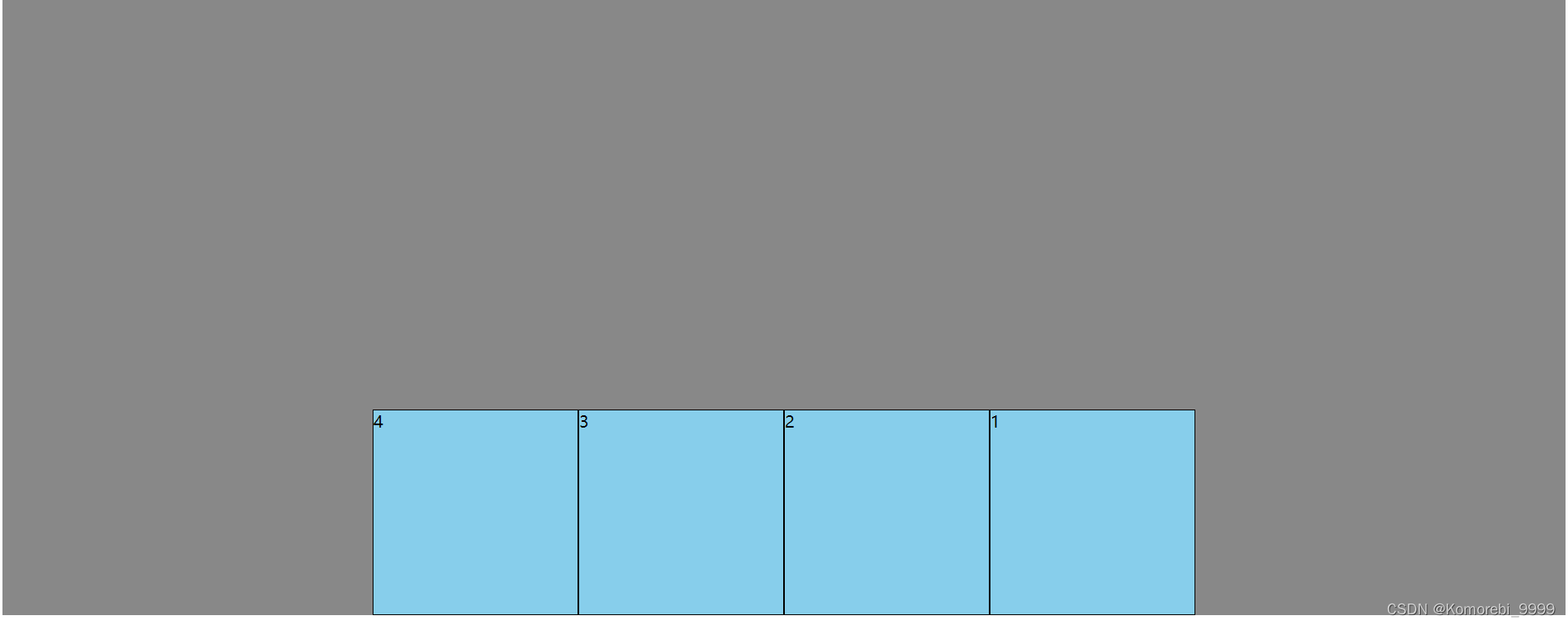
justify-content: space-evenly;
.outer{width:600px;height:600px;background-color:#888;/*将该元素变为了伸缩容器(开启了flex布局)*//*inline-flex把div都变成伸缩容器和行内块这两个作用*/display:flex;flex-direction: row-reverse;flex:1;flex-wrap:wrap-reverse;justify-content: space-evenly;} 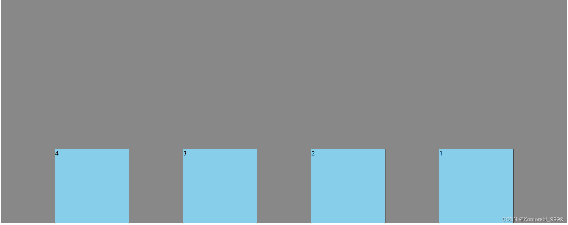 justify-content:space-around
<!DOCTYPE html>
<head><meta charset="UTF-8"><title>高度塌陷相关学习</title><style>/*body为最外面的父容器*/body{display:flex;}.outer{width:600px;height:600px;background-color:#888;/*将该元素变为了伸缩容器(开启了flex布局)*//*inline-flex把div都变成伸缩容器和行内块这两个作用*/display:flex;flex-direction: row;flex:1;justify-content:space-around;} /*只有直接的子容器才是伸缩项目*/.inner{width:200px;height:200px;background-color:skyblue;border:1px solid black;box-sizing:border-box;float:left;}</style>
</head>
<body><div class="outer"><div class="inner">1</div><div class="inner">2</div><div class="inner">3</div> <div class="inner">4</div><div class="inner">5</div><div class="inner">6</div></div></body>
</html>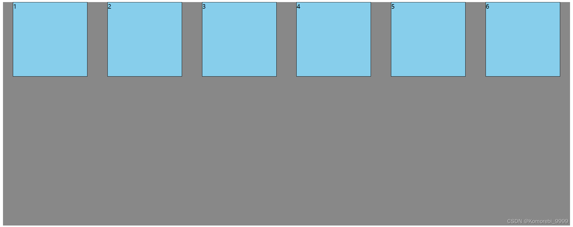
伸缩盒模型侧轴对齐
属性名:align-items(只有一行的情况)
属性值:
flex-start 侧轴的起点对齐
flex-end 侧轴的终点对齐
center 侧轴的中点对齐
baseline 伸缩项目的第一行文字的基线对齐
stretch 如果伸缩项目未设置高度,则占满整个容器的高度(默认值)
侧轴对齐多行
属性名:align-content
常用值如下
flext-start 与侧轴的起点对齐
flex-end 与侧轴的终点对齐
center 与侧轴的中点对齐
space-between 与侧轴两端对齐,中间平均分布
space-around 伸缩项目间的距离相等,比距边缘大一倍
space-evenly 在侧轴上完全平分
stretch 占满整个侧轴——默认值
align-content:space-between;
<!DOCTYPE html>
<head><meta charset="UTF-8"><title>高度塌陷相关学习</title><style>/*body为最外面的父容器*/body{display:flex;}.outer{width:600px;height:600px;background-color:#888;/*将该元素变为了伸缩容器(开启了flex布局)*//*inline-flex把div都变成伸缩容器和行内块这两个作用*/display:flex;flex-direction: row;flex-wrap: wrap;flex:1;align-content:space-between;} /*只有直接的子容器才是伸缩项目*/.inner{width:200px;height:200px;background-color:skyblue;border:1px solid black;box-sizing:border-box;float:left;}</style>
</head>
<body><div class="outer"><div class="inner">1</div><div class="inner">2</div><div class="inner">3</div> <div class="inner">4</div><div class="inner">5</div><div class="inner">6</div><div class="inner">7</div><div class="inner">8</div><div class="inner">9</div></div></body>
</html>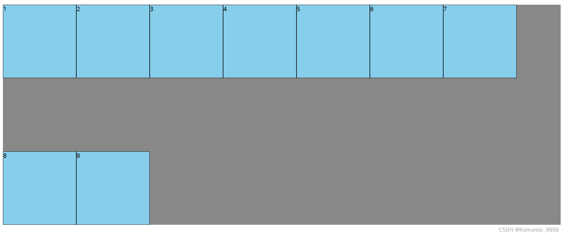 伸缩盒的水平垂直居中
方法一:
父容器开启伸缩盒模型,在父容器中设置子元素的水平垂直方向的居中
display:flex;
justify-content:center;
align-items:center;
<!DOCTYPE html>
<head><meta charset="UTF-8"><title>高度塌陷相关学习</title><style>/*body为最外面的父容器*/body{display:flex;}.outer{width:600px;height:600px;background-color:#888;/*将该元素变为了伸缩容器(开启了flex布局)*//*inline-flex把div都变成伸缩容器和行内块这两个作用*/display:flex;/*方案一:*/justify-content:center;align-items:center;} /*只有直接的子容器才是伸缩项目*/.inner{width:200px;height:200px;background-color:skyblue;border:1px solid black;box-sizing:border-box;float:left;}</style>
</head>
<body><div class="outer"><div class="inner">1</div><div class="inner">2</div><div class="inner">3</div> </div></body>
</html>
方案二:
父容器开启伸缩盒模型dispaly:flex;
子元素设置为margin:auto;
.outer{width:600px;height:600px;background-color:#888;/*将该元素变为了伸缩容器(开启了flex布局)*//*inline-flex把div都变成伸缩容器和行内块这两个作用*/display:flex;/*方案二:*/} /*只有直接的子容器才是伸缩项目*/.inner{width:200px;height:200px;background-color:skyblue;border:1px solid black;box-sizing:border-box;float:left;margin:auto;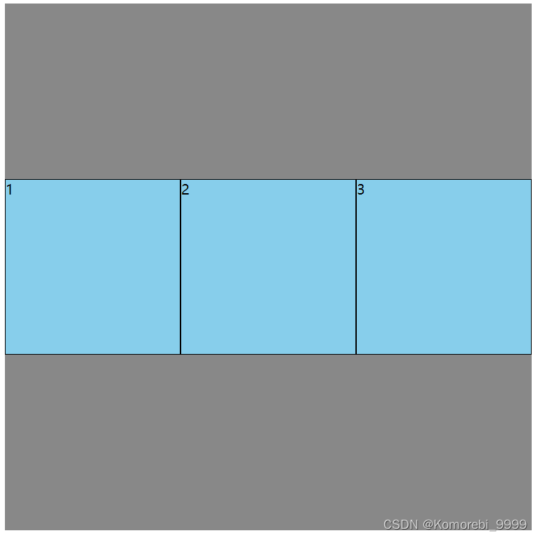
伸缩盒模型——基准长度
flex-basis
概念: flex-basis 设置的是主轴方向的基准长度,会让宽度或高度失效
备注:主轴横向:宽度失效,主轴纵向:高度失效
作用:浏览根据这个属性设置的值,计算主轴上是否有多余空间,默认值 auto,即;伸缩项目的宽或高。
<!DOCTYPE html>
<head><meta charset="UTF-8"><title>高度塌陷相关学习</title><style>/*body为最外面的父容器*/body{display:flex;}.outer{width:600px;height:600px;background-color:#888;/*将该元素变为了伸缩容器(开启了flex布局)*//*inline-flex把div都变成伸缩容器和行内块这两个作用*/display:flex;/*方案二:*/} /*只有直接的子容器才是伸缩项目*/.inner{width:200px;height:200px;background-color:skyblue;border:1px solid black;box-sizing:border-box;float:left;margin:auto;}.inner2{flex-basis:300px;}</style>
</head>
<body><div class="outer"><div class="inner">1</div><div class="inner">2</div><div class="inner inner2">3</div> </div></body>
</html>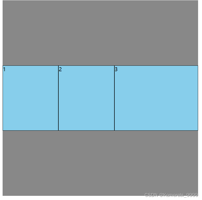
伸缩盒模型——基准长度
flex-basis
概念: flex-basis 设置的是主轴方向的基准长度,会让宽度或高度失效
备注:主轴横向:宽度失效,主轴纵向:高度失效
作用:浏览根据这个属性设置的值,计算主轴上是否有多余空间,默认值 auto,即;伸缩项目的宽或高。
伸缩盒模型的伸缩性:
flex-grow (伸)
概念: flex-grow 定义伸缩项目的放大比例,默认为0,即:纵使主轴存在剩余空间,也不拉伸(放大)。
规则:
1.若所有伸缩项目的 flex-grow 值都为1则:它们将等分剩余空间(如果有空间的话)。
2.若三个伸缩项目的 flex-grow 值分别为:则: 分别瓜分到: 1/6 、2/6 、 3/6 的空间。
<!DOCTYPE html>
<head><meta charset="UTF-8"><title>高度塌陷相关学习</title><style>/*body为最外面的父容器*/body{display:flex;}.outer{width:600px;height:600px;background-color:#888;/*将该元素变为了伸缩容器(开启了flex布局)*//*inline-flex把div都变成伸缩容器和行内块这两个作用*/display:flex;/*方案二:*/} /*只有直接的子容器才是伸缩项目*/.inner{width:100px;height:100px;background-color:skyblue;border:1px solid black;box-sizing:border-box;float:left;margin:auto;}.inner1{flex-grow:1;}.inner2{flex-grow:2;}.inner3{flex-grow:3;}</style>
</head>
<body><div class="outer"><div class="inner inner1">1</div><div class="inner inner2">2</div><div class="inner inner3">3</div> </div></body>
</html>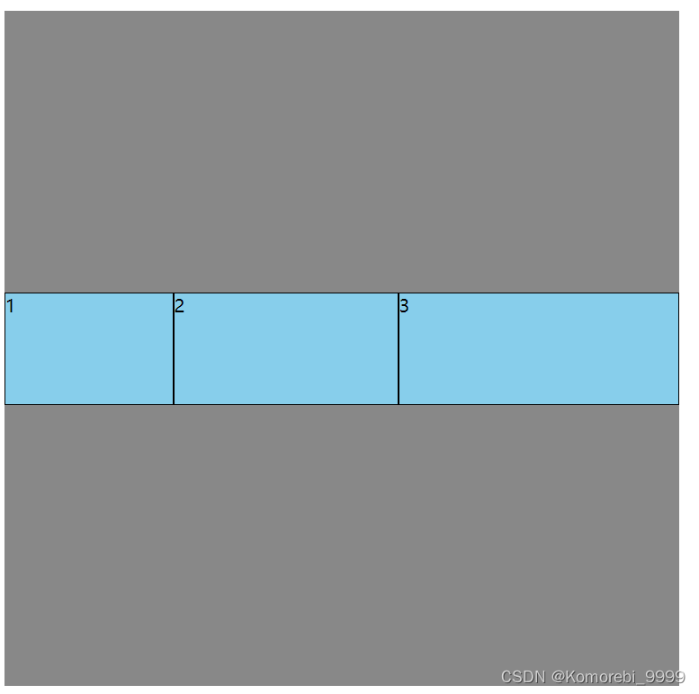
如果计算的时候有点偏差,是因为有边框的原因
flex-shrink(缩)
概念: flex-shrink 定义了项目的压缩比例,默认为1,即: 如果空间不足,该项目将会缩小。收缩项目的计算,略微复杂一点,我们拿一个场景举例:
例如
二个收缩项目,宽度分别为: 200px、 300px、 200px,它们的flex-shrink 值分别为: 1、2、3若想刚好容纳下三个项目,需要总宽度为 700px,但目前容器只有 480px,还差 300px所以每个人都要收缩一下才可以放下,具体收缩的值,这样计算:
1计算分母: (200x1) + (300x2) + (200x3) = 1400
2 计算比例:
项目一: (200x1) / 1400=比例值1
项目二: (300x2) / 1400=比例值2
项目三: (200x3) / 1400=比例值3
3.计算最终收缩大小:
项目一需要收缩: 比例值1 * 300 (乘号)
项目二需要收缩: 比例值2 *300
项目三需要收缩: 比例值3 * 300
flex复合属性
复合了flex-grow flex-shrink flex-basis
可以拉伸 可以压缩 不设置基准长度 可简写为flex:auto;
flex 是复合属性,复合了: flex-grow 、flex-shrink 、flex-basis 三个属性,默认值为 0 1 auto
如果写 flex:1 1 auto ,则可简写为: flex:auto
如果写 flex:1 1 0,则可简写为: flex:1
如果写 flex:0 0 auto 则可简与为: flex:none
如果写 flex:0 1 auto .则可简写为: flex: 0 auto --即 flex 初始值
1 1 0用的最多,auto代表以设置的宽高为准
项目排序和单独对齐
<!DOCTYPE html>
<head><meta charset="UTF-8"><title>高度塌陷相关学习</title><style>/*body为最外面的父容器*/body{display:flex;}.outer{width:600px;height:600px;background-color:#888;/*将该元素变为了伸缩容器(开启了flex布局)*//*inline-flex把div都变成伸缩容器和行内块这两个作用*/display:flex;/*方案二:*/} /*只有直接的子容器才是伸缩项目*/.inner{width:100px;height:100px;background-color:skyblue;border:1px solid black;box-sizing:border-box;float:left;margin:auto;}.inner1{order:3;}.inner2{order:2;}.inner3{order:1;}</style>
</head>
<body><div class="outer"><div class="inner inner1">1</div><div class="inner inner2">2</div><div class="inner inner3">3</div> </div></body>
</html>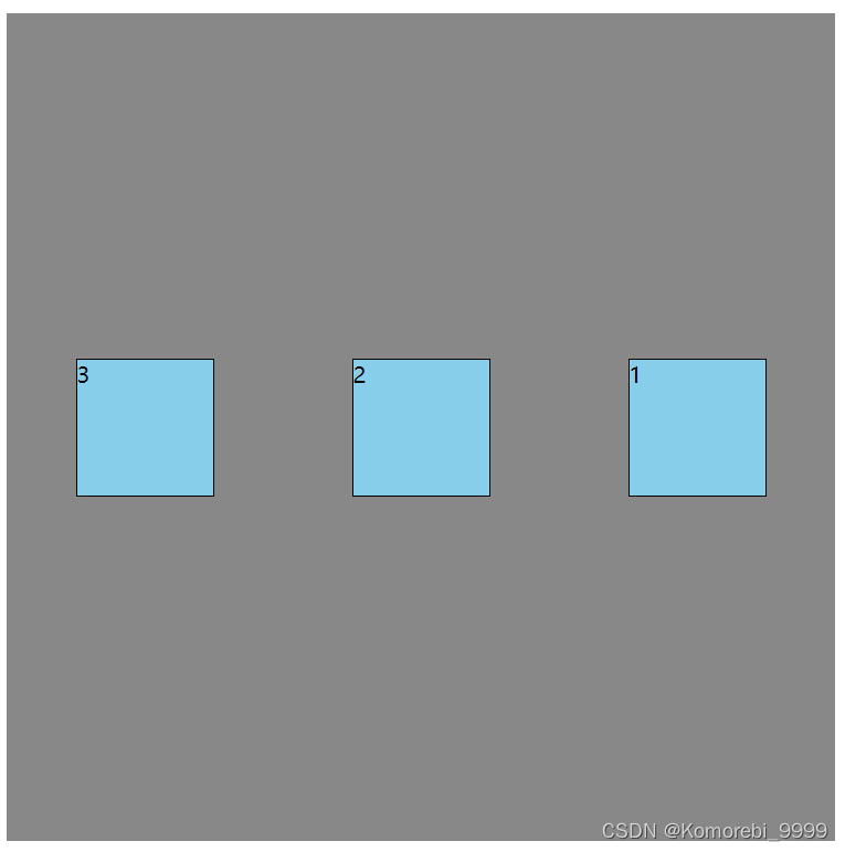
 .inner1{order:-3;}.inner2{order:-2;}.inner3{order:-1;}</style>
</head>
<body><div class="outer"><div class="inner inner1">1</div><div class="inner inner2">2</div><div class="inner inner3">3</div> </div></body>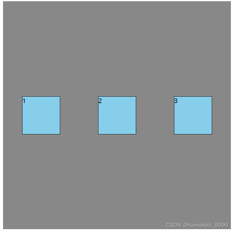
项目排序
order 属性定义项目的排列顺序。数值越小,排列越靠前,默认为0。
单独对齐
通过 align-self 属性,可以单独调整某个伸缩项目的对齐方式
默认值为 auto,表示继承父元素的 align-items 属性