有趣的CSS - 汉堡菜单按钮

大家好,我是 Just,这里是「设计师工作日常」,今天分享的是用 css 实现汉堡菜单图标与关闭图标过渡动画交互效果。
《有趣的css》系列最新实例通过公众号「设计师工作日常」发布。
目录
- 整体效果
- 核心代码
- html 代码
- css 部分代码
- 完整代码如下
- html 页面
- css 样式
- 页面渲染效果
整体效果
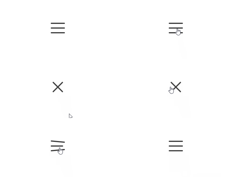
使用
transition过渡属性和transform变形属性,让汉堡图标和关闭图标之间进行过渡、变形,形成视觉效果。
适用于h5页面或者app页面中,隐藏菜单和打开菜单时使用。
核心代码部分,简要说明了写法思路;完整代码在最后,可直接复制到本地运行。
核心代码
html 代码
<label class="label16"><input class="inp16" type="checkbox"><span class="line16"></span><span class="line16"></span><span class="line16"></span>
</label>
label标签包裹input标签,input设置为多选按钮,三个span标签形成汉堡图标。
css 部分代码
.label16{width: 48px;height: 36px;display: block;position: relative;cursor: pointer;
}
.inp16{display: none;
}
.line16{width: inherit;height: 4px;border-radius: 2px;display: block;background-color: #3d3d3d;position: absolute;top: 0;transition: all 0.24s ease-in-out;
}
.line16:nth-of-type(2){top: 16px;
}
.line16:nth-of-type(3){top: 32px;
}
.inp16:checked ~ .line16:nth-of-type(1){transform: rotate(45deg);top: 16px;
}
.inp16:checked ~ .line16:nth-of-type(2){width: 0;
}
.inp16:checked ~ .line16:nth-of-type(3){transform: rotate(-45deg);top: 16px;
}
隐藏
input多选按钮,设置transition过渡效果,当input多选按钮选中时,三个span标签设置变形效果,汉堡图标变形过渡到关闭图标。
完整代码如下
html 页面
<!DOCTYPE html>
<html lang="zh"><head><meta charset="utf-8"><link rel="stylesheet" href="style.css"><title>汉堡菜单按钮</title></head><body><div class="app"><label class="label16"><input class="inp16" type="checkbox"><span class="line16"></span><span class="line16"></span><span class="line16"></span></label></div></body>
</html>
css 样式
/** style.css **/
.app{width: 100%;height: 100vh;background-color: #ffffff;position: relative;display: flex;justify-content: center;align-items: center;
}
.label16{width: 48px;height: 36px;display: block;position: relative;cursor: pointer;
}
.inp16{display: none;
}
.line16{width: inherit;height: 4px;border-radius: 2px;display: block;background-color: #3d3d3d;position: absolute;top: 0;transition: all 0.24s ease-in-out;
}
.line16:nth-of-type(2){top: 16px;
}
.line16:nth-of-type(3){top: 32px;
}
.inp16:checked ~ .line16:nth-of-type(1){transform: rotate(45deg);top: 16px;
}
.inp16:checked ~ .line16:nth-of-type(2){width: 0;
}
.inp16:checked ~ .line16:nth-of-type(3){transform: rotate(-45deg);top: 16px;
}
页面渲染效果
以上就是所有代码,以及简单的思路,希望对你有一些帮助或者启发。
[1] 原文阅读
CSS 是一种很酷很有趣的计算机语言,在这里跟大家分享一些 CSS 实例 Demo,为学习者获取灵感和思路提供一点帮助,希望你们喜欢。
我是 Just,这里是「设计师工作日常」,求点赞求关注!