Vue插槽

Vue插槽
- 一、插槽-默认插槽
- 1.作用
- 2.需求
- 3.问题
- 4.插槽的基本语法
- 5.代码示例
- 6.总结
- 二、插槽-后备内容(默认值)
- 1.问题
- 2.插槽的后备内容
- 3.语法
- 4.效果
- 5.代码示例
- 三、插槽-具名插槽
- 1.需求
- 2.具名插槽语法
- 3.v-slot的简写
- 4.代码示例
- 5.总结
- 四、作用域插槽
- 1.插槽分类
- 2.作用
- 3.场景
- 4.使用步骤
- 5.代码示例
- 6.总结
一、插槽-默认插槽
1.作用
让组件内部的一些 结构 支持 自定义
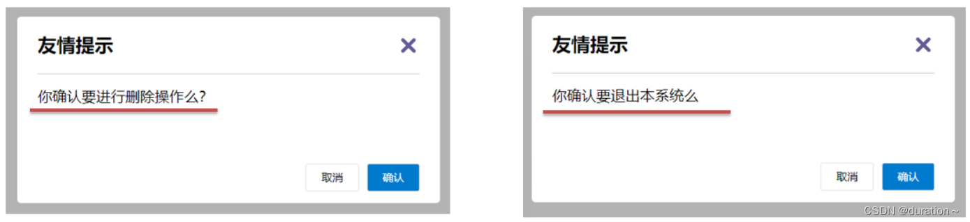
2.需求
将需要多次显示的对话框,封装成一个组件
3.问题
组件的内容部分,不希望写死,希望能使用的时候自定义。怎么办
4.插槽的基本语法
- 组件内需要定制的结构部分,改用
<slot></slot>占位 - 使用组件时,
<MyDialog></MyDialog>标签内部, 传入结构替换 slot - 给插槽传入内容时,可以传入纯文本、html标签、组件
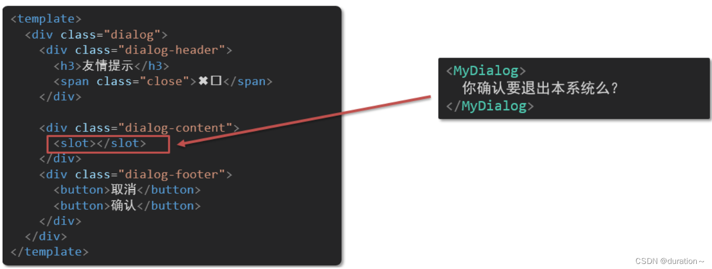
5.代码示例
MyDialog.vue
<template><div class="dialog"><div class="dialog-header"><h3>友情提示</h3><span class="close">✖️</span></div><div class="dialog-content"><slot></slot></div><div class="dialog-footer"><button>取消</button><button>确认</button></div></div>
</template><script>
export default {data () {return {}}
}
</script><style scoped>
* {margin: 0;padding: 0;
}
.dialog {width: 470px;height: 230px;padding: 0 25px;background-color: #ffffff;margin: 40px auto;border-radius: 5px;
}
.dialog-header {height: 70px;line-height: 70px;font-size: 20px;border-bottom: 1px solid #ccc;position: relative;
}
.dialog-header .close {position: absolute;right: 0px;top: 0px;cursor: pointer;
}
.dialog-content {height: 80px;font-size: 18px;padding: 15px 0;
}
.dialog-footer {display: flex;justify-content: flex-end;
}
.dialog-footer button {width: 65px;height: 35px;background-color: #ffffff;border: 1px solid #e1e3e9;cursor: pointer;outline: none;margin-left: 10px;border-radius: 3px;
}
.dialog-footer button:last-child {background-color: #007acc;color: #fff;
}
</style>
App.vue
<template><div><MyDialog><p>你确认要删除吗</p></MyDialog><MyDialog><a href="#">在吗</a></MyDialog></div>
</template><script>
import MyDialog from './components/MyDialog.vue'
export default {data () {return {}},components: {MyDialog}
}
</script><style>
body {background-color: #b3b3b3;
}
</style>
6.总结
场景:组件内某一部分结构不确定,想要自定义怎么办
使用:插槽的步骤分为哪几步?
二、插槽-后备内容(默认值)
1.问题
通过插槽完成了内容的定制,传什么显示什么, 但是如果不传,则是空白
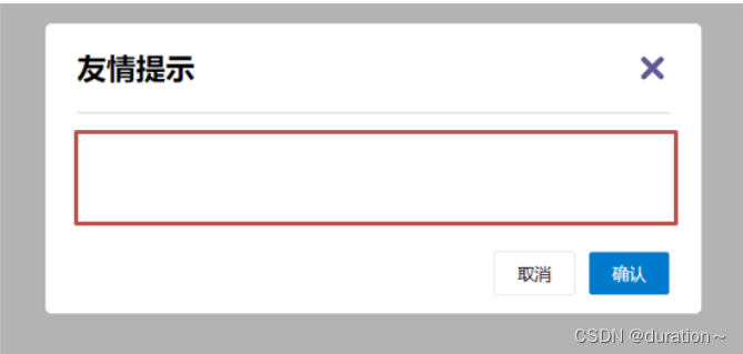
能否给插槽设置 默认显示内容 呢?
2.插槽的后备内容
封装组件时,可以为预留的 <slot> 插槽提供后备内容(默认内容)。
3.语法
在 <slot> 标签内,放置内容, 作为默认显示内容
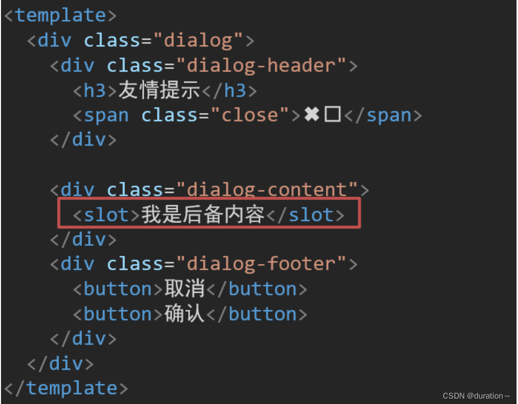
4.效果
-
外部使用组件时,不传东西,则slot会显示后备内容

-
外部使用组件时,传东西了,则slot整体会被换掉

5.代码示例
MyDialog.vue
<template><div class="dialog"><div class="dialog-header"><h3>友情提示</h3><span class="close">✖️</span></div><div class="dialog-content"><slot>我是后备内容</slot></div><div class="dialog-footer"><button>取消</button><button>确认</button></div></div>
</template><script>
export default {data () {return {}}
}
</script><style scoped>
* {margin: 0;padding: 0;
}
.dialog {width: 470px;height: 230px;padding: 0 25px;background-color: #ffffff;margin: 40px auto;border-radius: 5px;
}
.dialog-header {height: 70px;line-height: 70px;font-size: 20px;border-bottom: 1px solid #ccc;position: relative;
}
.dialog-header .close {position: absolute;right: 0px;top: 0px;cursor: pointer;
}
.dialog-content {height: 80px;font-size: 18px;padding: 15px 0;
}
.dialog-footer {display: flex;justify-content: flex-end;
}
.dialog-footer button {width: 65px;height: 35px;background-color: #ffffff;border: 1px solid #e1e3e9;cursor: pointer;outline: none;margin-left: 10px;border-radius: 3px;
}
.dialog-footer button:last-child {background-color: #007acc;color: #fff;
}
</style>
App.vue
<template><div><MyDialog></MyDialog><MyDialog>你确认要退出么</MyDialog></div>
</template><script>
import MyDialog from './components/MyDialog.vue'
export default {data () {return {}},components: {MyDialog}
}
</script><style>
body {background-color: #b3b3b3;
}
</style>
三、插槽-具名插槽
1.需求
一个组件内有多处结构,需要外部传入标签,进行定制 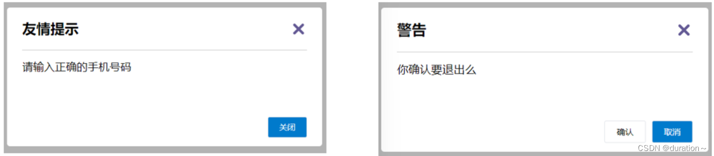
上面的弹框中有三处不同,但是默认插槽只能定制一个位置,这时候怎么办呢?
2.具名插槽语法
-
多个slot使用
name属性区分名字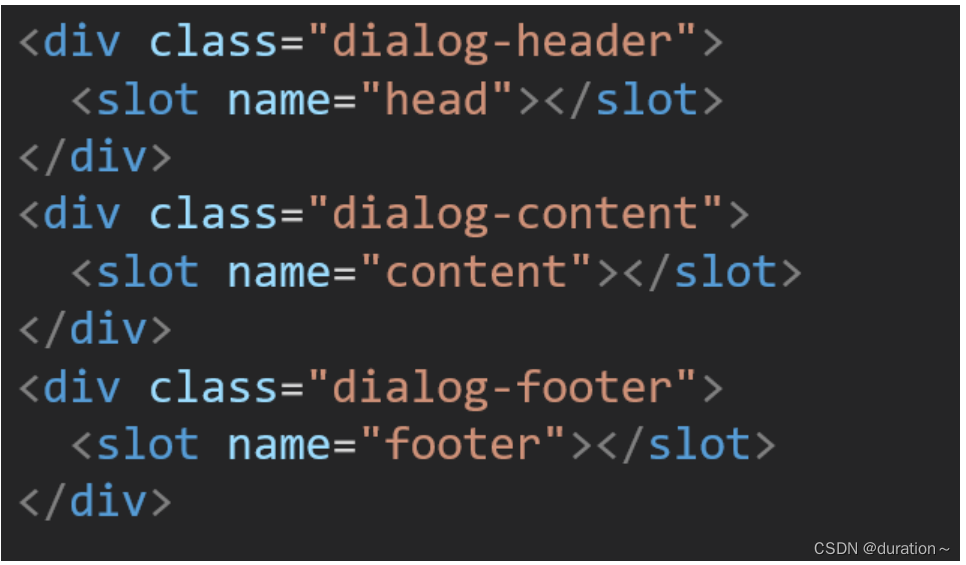
-
template配合v-slot:名字来分发对应标签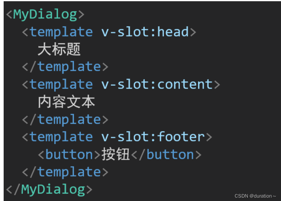
3.v-slot的简写
v-slot写起来太长,vue给我们提供一个简单写法 v-slot —> #
4.代码示例
App.vue
<template><div><MyDialog><template v-slot:head><h3>警告</h3></template><template #content>确定要退出吗</template><template #footer><button>确定</button><button>退出</button></template></MyDialog></div>
</template>
<script>
import MyDialog from './components/MyDialog.vue'
export default {data () {return {}},components: {MyDialog}
}
</script><style>
body {background-color: #b3b3b3;
}
</style>
MyDialog.vue
<template><div class="dialog"><div class="dialog-header"><slot name="head"></slot><span class="close">✖️</span></div><div class="dialog-content"><slot name="content">我是后备内容</slot></div><div class="dialog-footer"><slot name="footer"></slot></div></div>
</template><script>
export default {data () {return {}}
}
</script><style scoped>
* {margin: 0;padding: 0;
}
.dialog {width: 470px;height: 230px;padding: 0 25px;background-color: #ffffff;margin: 40px auto;border-radius: 5px;
}
.dialog-header {height: 70px;line-height: 70px;font-size: 20px;border-bottom: 1px solid #ccc;position: relative;
}
.dialog-header .close {position: absolute;right: 0px;top: 0px;cursor: pointer;
}
.dialog-content {height: 80px;font-size: 18px;padding: 15px 0;
}
.dialog-footer {display: flex;justify-content: flex-end;
}
.dialog-footer button {width: 65px;height: 35px;background-color: #ffffff;border: 1px solid #e1e3e9;cursor: pointer;outline: none;margin-left: 10px;border-radius: 3px;
}
.dialog-footer button:last-child {background-color: #007acc;color: #fff;
}
</style>
5.总结
- 组件内 有多处不确定的结构 怎么办?
- 具名插槽的语法是什么?
- v-slot:插槽名可以简化成什么?
- 一旦插槽起了名字就只是具名插槽,只支持定向分发。
- 需要使用
template标签进行包裹,不然无法区分整体。
四、作用域插槽
1.插槽分类
-
默认插槽
-
具名插槽
插槽只有两种,作用域插槽不属于插槽的一种分类
2.作用
定义slot 插槽的同时, 是可以传值的。给 插槽 上可以 绑定数据,将来 使用组件时可以用
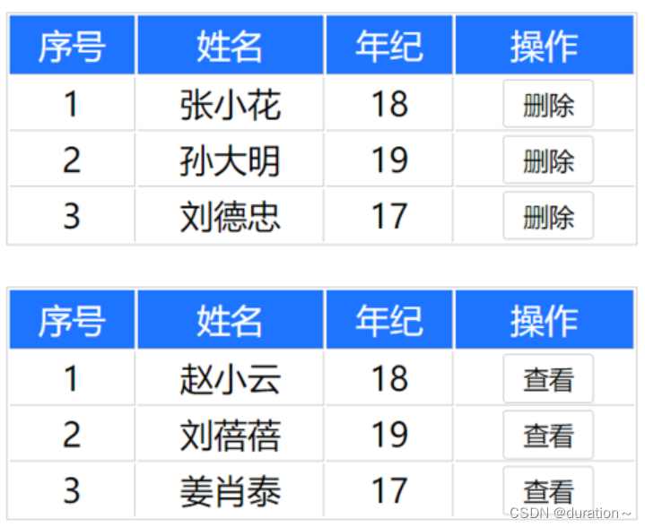
3.场景
封装表格组件(id和操作不同)
4.使用步骤
-
给 slot 标签, 以 添加属性的方式传值
<slot :id="item.id" msg="测试文本"></slot> -
所有添加的属性, 都会被收集到一个对象中
{ id: 3, msg: '测试文本' } -
在template中, 通过
#插槽名= "obj"接收,默认插槽名为default<MyTable :list="list"><template #default="obj"><button @click="del(obj.id)">删除</button></template> </MyTable>
5.代码示例
MyTable.vue
<template><table class="my-table"><thead><tr><th>序号</th><th>姓名</th><th>年纪</th><th>操作</th></tr></thead><tbody><tr v-for="(item,index) in data" :key="item.id"><td>{{ index + 1 }}</td><td>{{ item.name }}</td><td>{{ item.age }}</td><td>
<!--       1. 给我们的slot标签以添加属性的方式传值--><slot :row="item" msg="测试文本"></slot>
<!--        2.会将所有的属性添加到一个对象当中--></td></tr></tbody></table>
</template><script>
export default {props: {data: Array}
}
</script><style scoped>
.my-table {width: 450px;text-align: center;border: 1px solid #ccc;font-size: 24px;margin: 30px auto;
}.my-table thead {background-color: #1f74ff;color: #fff;
}.my-table thead th {font-weight: normal;
}.my-table thead tr {line-height: 40px;
}.my-table th,
.my-table td {border-bottom: 1px solid #ccc;border-right: 1px solid #ccc;
}.my-table td:last-child {border-right: none;
}.my-table tr:last-child td {border-bottom: none;
}.my-table button {width: 65px;height: 35px;font-size: 18px;border: 1px solid #ccc;outline: none;border-radius: 3px;cursor: pointer;background-color: #ffffff;margin-left: 5px;
}
</style>
App.vue
<template><div><MyTable :data="list"><template #default="{ row }"><button @click="show(row)">查看</button></template></MyTable><MyTable :data="list2"><!--      3.通过template #插槽名="变量名" 进行接收--><template #default="obj">{{ obj.msg }}<button @click="del(obj.row.id)">删除</button></template></MyTable></div>
</template><script>
import MyTable from './components/MyTable.vue'export default {methods: {del(id) {console.log(id)this.list2 = this.list2.filter(item => item.id !== id)}, show(row) {console.log(row)}},data() {return {list: [{id: 1, name: '张小花', age: 18},{id: 2, name: '孙大明', age: 19},{id: 3, name: '刘德忠', age: 17},],list2: [{id: 1, name: '赵小云', age: 18},{id: 2, name: '刘蓓蓓', age: 19},{id: 3, name: '姜肖泰', age: 17},]}},components: {MyTable}
}
</script>
6.总结
1.作用域插槽的作用是什么?
2.作用域插槽的使用步骤是什么?