HarmonyOS学习第二章:初识ArkTs/ArkUI,常用组件(待补充)
)
文章目录
- 一、ArkTs
- 1.1 简介
- 1.2 关键特性
- 1.3 基础代码结构
- 1.3.1 示例:
- 1.3.2 页面组件
- 1.3.3 自定义组件
- 二、ArkUI
- 2.1 ArkUI介绍
- 2.2 开发范式
- 三、常用组件的使用
- 3.1 Text组件
- 3.2 Column 列组件
- 3.3 Row 行组件
- 3.4 Flex 以弹性方式容器组件
- 3.5 Grid 网格布局组件
- 3.6 Button 按钮组件
- 3.7 TextInput 输入框组件
- 3.8 Image 图片组件
- 3.9 Toggle 切换组件
- 3.10 Slider 滑块组件
- 3.11 progress 进度条组件
- 3.12 Stack 堆叠组件
- 3.13 Blank 组件
- 3.14 Divider 分割线组件
- 3.15 List 列表组件
- 3.16 Scroll 滚动组件
- 四、补充:在编辑器中查看组件文档
- 4.1 DevEco Studio编辑器内查看官方文档
一、ArkTs
1.1 简介
ArkTS是HarmonyOS的应用开发语言,它在保持
TypeScript(简称TS)基本语法风格的基础上,对TS的动态类型特性施加了更严格的约束,并引入了静态类型。
1.2 关键特性
-
声明式UI、自定义组件、动态扩展UI元素
ArkTS定义了声明式UI描述、自定义组件和动态扩展UI元素的能力,再配合ArkUI开发框架中的系统组件及其相关的事件方法、属性方法等共同构成了UI开发的主体。下面是一个示例,是一个基础的ArkTs书写的代码片段,展示了ArkTs声明式UI的能力:
@Entry @Component struct MyComponent { @State private text: string = 'Hello, HarmonyOS!'; build() { Row() { Text(this.text) .fontSize(20) .fontWeight(FontWeight.Bold) .onClick(() => { this.text = 'You clicked me!'; }); } } } -
状态管理
ArkTS提供了多维度的状态管理机制。在UI开发框架中,与UI相关联的数据可以在组件内使用,也可以在不同组件层级间传递,比如父子组件之间、爷孙组件之间,还可以在应用全局范围内传递或跨设备传递。另外,从数据的传递形式来看,可分为只读的单向传递和可变更的双向传递。开发者可以灵活地利用这些能力来实现数据和UI的联动。
-
渲染控制
ArkTS提供了渲染控制的能力。条件渲染可根据应用的不同状态,渲染对应状态下的UI内容。循环渲染可从数据源中迭代获取数据,并在每次迭代过程中创建相应的组件。数据懒加载从数据源中按需迭代数据,并在每次迭代过程中创建相应的组件。
1.3 基础代码结构

1.3.1 示例:
注意:build()函数中只能包含一个根节点
1.3.2 页面组件
// @Entry 装饰器 - 代表入口
@Entry
// @Component 装饰器 - 代表组件
@Component
// struct 声明组件 Index 表示自定义的组件名称
struct Index {// @State 装饰器@State message: string = '鸿蒙开发'@State color: string = 'green'// @Builder装饰器:自定义构建函数build() {// 只能包含一个根节点// 下面的都属于UI描述器,可以理解为HTML中的元素、CSS中的属性// Row Column Text 都属于系统组件Row() {Column() {Text(this.message)// fontSize 属性,和css中的font-size一致,用来设置文字大小,单位是VP.fontSize(50)// fontWeight 属性,和css中的font-weight一致,用来设置字体粗细.fontWeight(FontWeight.Bold)// fontColor 设置字体颜色.fontColor(this.color)// onClick 点击事件.onClick(() => {console.log('我被点击了!!!')})}// 设置Column组件宽度,可以是百分数,也可以是具体数值,写具体数值时不带单位.width('100%')}// 设置Row组件高度.height('100%')}
}
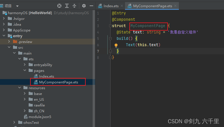
1.3.3 自定义组件
-
首先在入口文件同级下新建一个组件文件
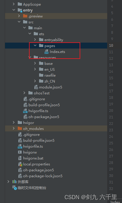
-
选择新建ArkTS File
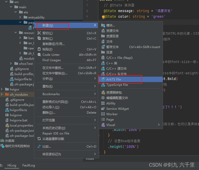
-
自定义文件名称
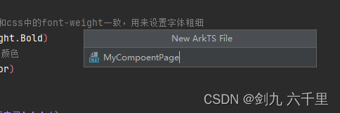
-
编写代码
-
预览
双击进入到MyComponentPage.ets文件下,点击右侧预览窗口的刷新
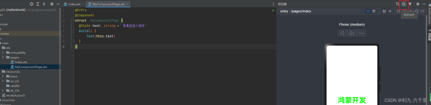
效果已经有了

二、ArkUI
2.1 ArkUI介绍
ArkUI是一套构建分布式应用界面的声明式UI开发框架。它使用极简的UI信息语法、丰富的UI组件、以及实时界面预览工具
2.2 开发范式
ArkUI针对不同的应用场景及技术背景,提供了两种开发范式,分别是基于ArkTS的声明式开发范式(简称“声明式开发范式”)和兼容JS的类Web开发范式(简称“类Web开发范式”)。推荐使用声明式开发范式。
- 声明式开发范式:采用基于TypeScript声明式UI语法扩展而来的ArkTS语言,从组件、动画和状态管理三个维度提供UI绘制能力。
- Web开发范式:原生的html、css、js开发
三、常用组件的使用
这里列举了一些常用的组件,有前端开发经验的同学可以查看官方文档。
3.1 Text组件
文本组件,可以用于放置文本类内容
-
基础用法
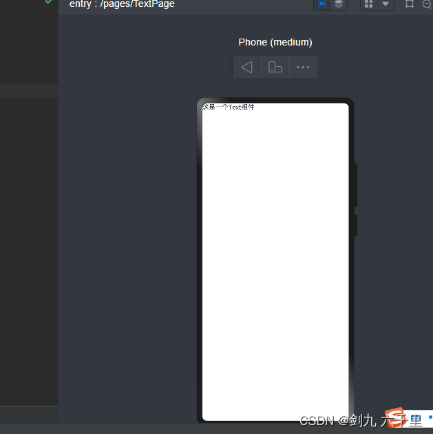
@Entry @Component struct TextPage {build() {Text('这是一个Text组件')} } -
设置一些样式
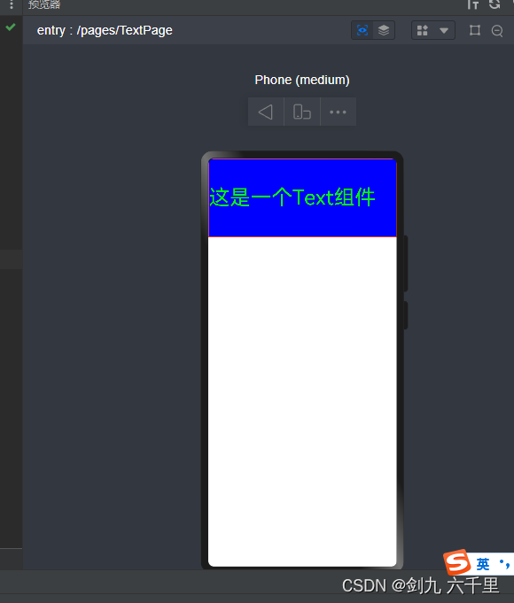
可以在组件后面链式调用属性:@Entry @Component struct TextPage {build() {Text('这是一个Text组件').height(150).width('100%').backgroundColor('blue').fontColor('green').fontSize(40).border({ width: 1, color: '#f40' })} } -
也可以插入span组件
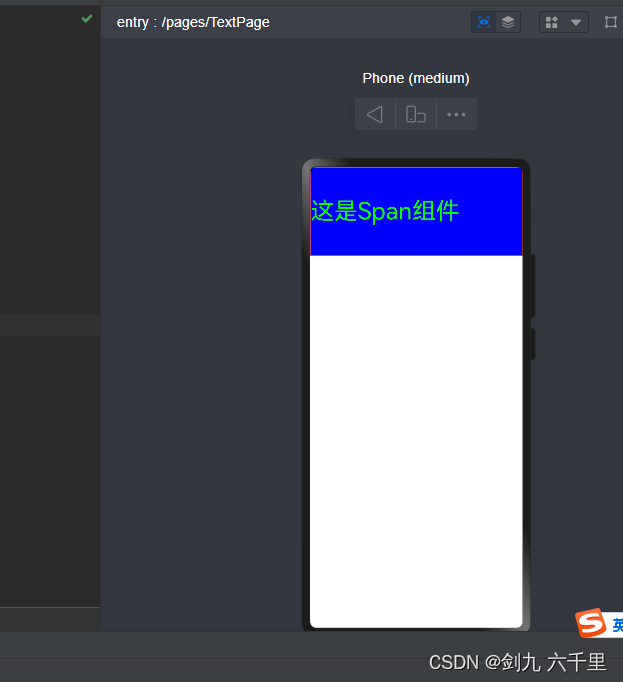
注意:组件有两种方式书写,一种是向上面那种直接写属性、传值,一种是下面这种在组件的{}中书写内容,下面这种写法在花括号中加了span组件之后,Text组件传递的参数就不生效了@Entry @Component struct TextPage {build() {Text('这是一个Text组件') {Span('这是Span组件').height(100).width(100)}.height(150).width('100%').backgroundColor('blue').fontColor('green').fontSize(40).border({ width: 1, color: '#f40' })} }
3.2 Column 列组件
纵向排列的组件,主轴是Y,内部可以书写任意组件(注意build组件内只能有一个根组件)
-
基本使用

@Entry @Component struct ColumnPage {build() {Column() {Text('这是header').backgroundColor('red').width(100).height(100)Text('这是main').backgroundColor('green').width(100).height(100)Text('这是footer').backgroundColor('blue').width(100).height(100)}} } -
column接收参数,增加间距
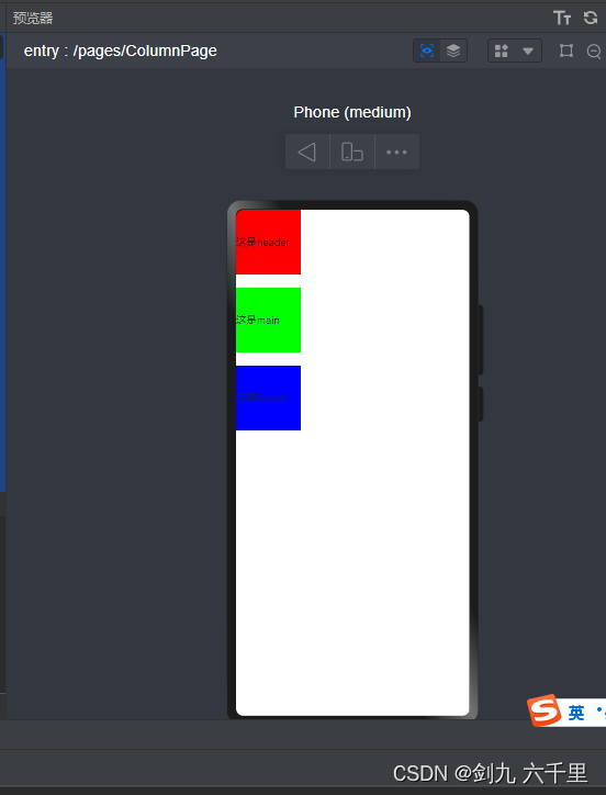
传递space参数,改变每个元素之间的间距:@Entry @Component struct ColumnPage {build() {Column({ space: 20 }) {Text('这是header').backgroundColor('red').width(100).height(100)Text('这是main').backgroundColor('green').width(100).height(100)Text('这是footer').backgroundColor('blue').width(100).height(100)}} } -
写一个常见的水平垂直居中布局
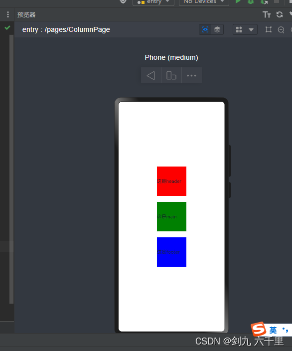
此处的.alignItems(HorizontalAlign.Center)和.justifyContent(FlexAlign.Center)可以理解为css中的Flex布局。Flex常用的属性都可以使用,更多使用可以查看官方文档。@Entry @Component struct ColumnPage {build() {Column({ space: 20 }) {Text('这是header').backgroundColor('red').width(100).height(100)Text('这是main').backgroundColor(Color.Green).width(100).height(100)Text('这是footer').backgroundColor(Color.Blue).width(100).height(100)}.width('100%').height('100%').alignItems(HorizontalAlign.Center)// .alignItems(HorizontalAlign.Start)// .alignItems(HorizontalAlign.End).justifyContent(FlexAlign.Center)// .justifyContent(FlexAlign.End)// .justifyContent(FlexAlign.SpaceBetween)} }
一般来说Column组件搭配Row组件一起使用,来实现一些常见的布局样式。
3.3 Row 行组件
水平排列的组件,主轴是X,内部可以书写任意组件(注意build组件内只能有一个根组件)
- 基本使用
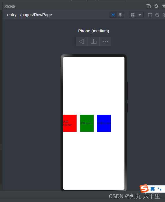
使用方法和Column组件基本一致:@Entry @Component struct RowPage {build() {Row({ space: 20 }) {Text('这是header').backgroundColor('red').width(80).height(100)Text('这是main').backgroundColor(Color.Green).width(80).height(100)Text('这是footer').backgroundColor(Color.Blue).width(80).height(100)}.width('100%').height('100%')} } - 写一个常见的布局样式
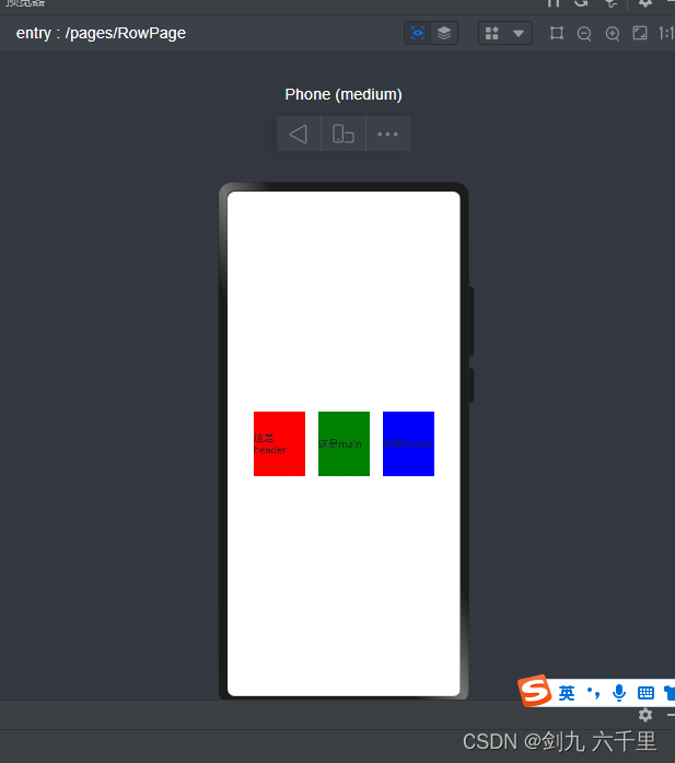
flex布局常见的属性在Row组件中同样适用:@Entry @Component struct RowPage {build() {Row({ space: 20 }) {Text('这是header').backgroundColor('red').width(80).height(100)Text('这是main').backgroundColor(Color.Green).width(80).height(100)Text('这是footer').backgroundColor(Color.Blue).width(80).height(100)}.width('100%').height('100%').alignItems(VerticalAlign.Center).justifyContent(FlexAlign.Center)} }
3.4 Flex 以弹性方式容器组件
弹性盒布局,不了解弹性盒布局的同学可先学习一下css中的弹性盒布局。官方推荐使用Row和Column组件。
-
基本使用
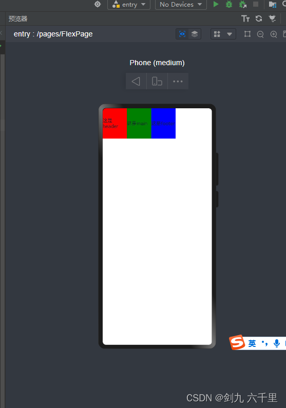
column是一列多行展示,通过Flex组件将其一行展示:@Entry @Component struct FlexPage {build() {Flex() {Column() {Text('这是header').backgroundColor('red').width(80).height(100)}Column() {Text('这是main').backgroundColor(Color.Green).width(80).height(100)}Column() {Text('这是footer').backgroundColor(Color.Blue).width(80).height(100)}}.width('100%').height('100%')} } -
写一个常见的布局样式(水平垂直居中)
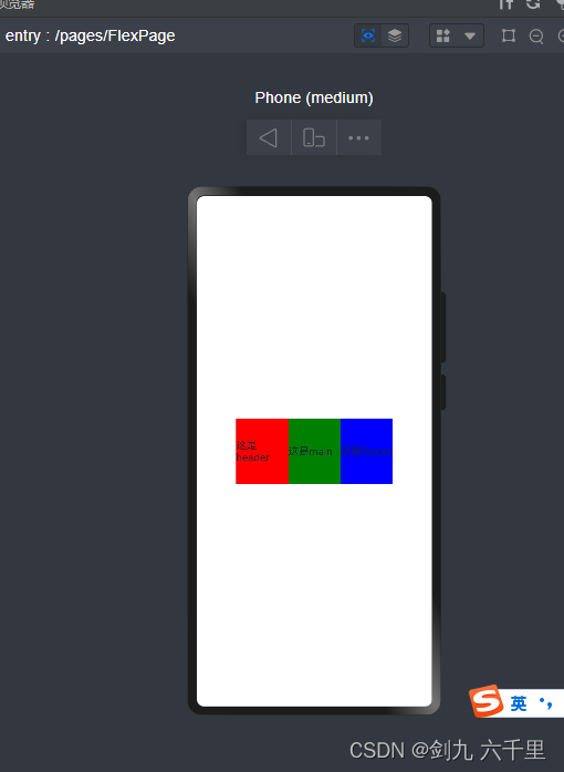
通过Flex组件参数,设置样式:@Entry @Component struct FlexPage {build() {Flex({ direction: FlexDirection.Row, alignItems: ItemAlign.Center, justifyContent: FlexAlign.Center}) {Column() {Text('这是header').backgroundColor('red').width(80).height(100)}Column() {Text('这是main').backgroundColor(Color.Green).width(80).height(100)}Column() {Text('这是footer').backgroundColor(Color.Blue).width(80).height(100)}}.width('100%').height('100%')} }
3.5 Grid 网格布局组件
注意:Grid组件内部只能使用GridItem组件
Grid组件和css中的display:grid;属性原理基本是一致的。前端同学可以按css中的grid布局来理解这个Grid组件。
-
基本使用
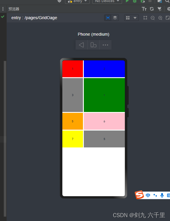
columnsTemplate 写几个参数表示有几列 此处表示有两列:
fr 表示份数,此处表示将宽度等分成3份,第一列占 1/3,第二列占 2/3:
rowsTemplate 写几个参数就有几行 此处表示有四行:
fr 表示份数,此处表示将高度等分成5分,第二行占 2/5,其他行各占 1/5:@Entry @Component struct GridPage {build() {Grid() {GridItem() {Text('1')}.backgroundColor(Color.Red)GridItem() {Text('2')}.backgroundColor(Color.Blue)GridItem() {Text('3')}.backgroundColor(Color.Gray)GridItem() {Text('4')}.backgroundColor(Color.Green)GridItem() {Text('5')}.backgroundColor(Color.Orange)GridItem() {Text('6')}.backgroundColor(Color.Pink)GridItem() {Text('7')}.backgroundColor(Color.Yellow)GridItem() {Text('8')}.backgroundColor(Color.Grey)}.width('100%').height(500)// columnsTemplate 写几个参数表示有几列 此处表示有两列// fr 表示份数,此处表示将宽度等分成3份,第一列占 1/3,第二列占 2/3.columnsTemplate('1fr 2fr')// rowsTemplate 写几个参数就有几行 此处表示有四行// fr 表示份数,此处表示将高度等分成5分,第二行占 2/5,其他行各占 1/5.rowsTemplate('1fr 2fr 1fr 1fr')// 列和列之间的间距.columnsGap(5)// 行和行之间的间距.rowsGap(5)} } -
写一个常见的布局样式
合并行或者合并列: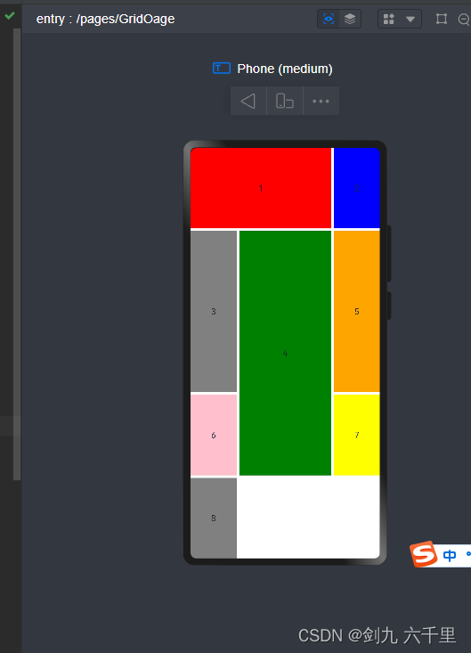
.columnStart(1).columnEnd(2) 表示第一列和第二列盒子合并,第三列会被挤到下一行去:
.rowStart(1).rowEnd(2) 表示当前行和下一行合并:@Entry @Component struct GridPage {build() {Grid() {GridItem() {Text('1')// .columnStart(1).columnEnd(2) 表示第一列和第二列盒子合并,第三列会被挤到下一行去}.backgroundColor(Color.Red).columnStart(1).columnEnd(2)GridItem() {Text('2')}.backgroundColor(Color.Blue)GridItem() {Text('3')}.backgroundColor(Color.Gray)GridItem() {Text('4')// .rowStart(1).rowEnd(2) 表示当前行和下一行合并}.backgroundColor(Color.Green).rowStart(1).rowEnd(2)GridItem() {Text('5')}.backgroundColor(Color.Orange)GridItem() {Text('6')}.backgroundColor(Color.Pink)GridItem() {Text('7')}.backgroundColor(Color.Yellow)GridItem() {Text('8')}.backgroundColor(Color.Grey)}.width('100%').height('100%')// columnsTemplate 写几个参数表示有几列 此处表示有两列// fr 表示份数,此处表示将宽度等分成3份,第一列占 1/3,第二列占 2/3.columnsTemplate('1fr 2fr 1fr')// rowsTemplate 写几个参数就有几行 此处表示有四行// fr 表示份数,此处表示将高度等分成5分,第二行占 2/5,其他行各占 1/5.rowsTemplate('1fr 2fr 1fr 1fr')// 列和列之间的间距.columnsGap(5)// 行和行之间的间距.rowsGap(5)} }
3.6 Button 按钮组件
-
基础用法

也可以这么使用:Button(‘登陆’):@Entry @Component struct ButtonPage {build() {Button() {Text('登陆')}.height(100).width(200)} } -
事件绑定(支持通用事件)
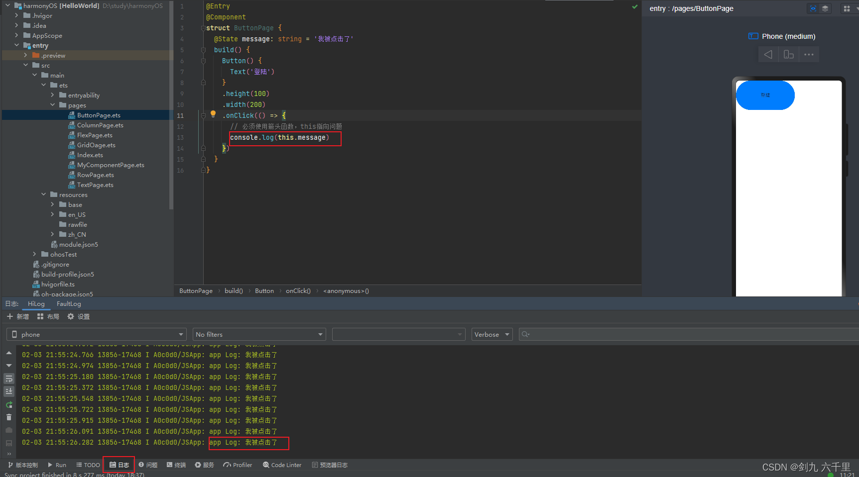
必须使用箭头函数,this指向问题:
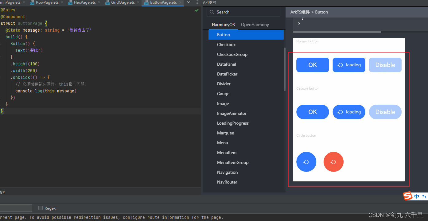
接收一个参数,事件对象:@Entry @Component struct ButtonPage {@State message: string = '我被点击了'build() {Button() {Text('登陆')}.height(100).width(200).onClick(() => {// 必须使用箭头函数,this指向问题console.log(this.message)})} }还有很多的按钮样式属性,可以查看官方文档
3.7 TextInput 输入框组件
-
基本使用

@Entry @Component struct TextInputPage {build() {Row() {TextInput().backgroundColor(Color.White)}.height('100%').width('100%').backgroundColor(Color.Yellow).padding(10)} } -
增加placeholder
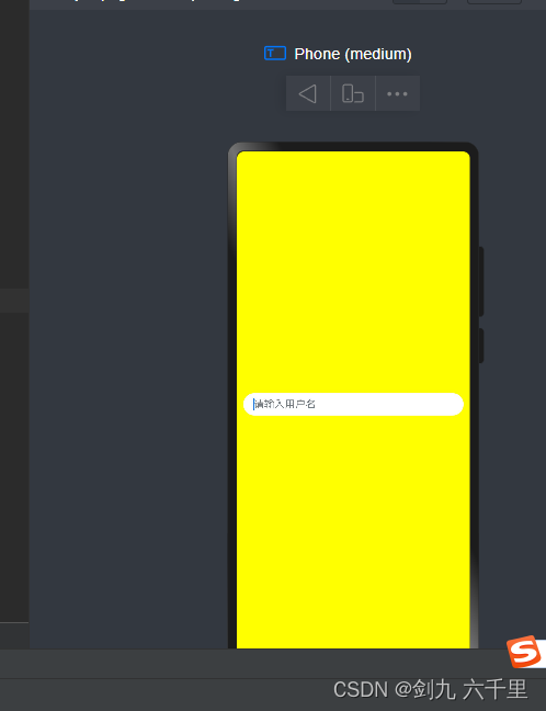
@Entry @Component struct TextInputPage {build() {Row() {TextInput({ placeholder: '请输入用户名'}).backgroundColor(Color.White)}.height('100%').width('100%').backgroundColor(Color.Yellow).padding(10)} } -
增加默认值
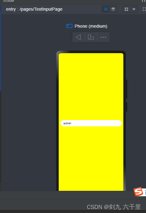
@Entry @Component struct TextInputPage {build() {Row() {TextInput({ placeholder: '请输入用户名', text: 'admin'}).backgroundColor(Color.White)}.height('100%').width('100%').backgroundColor(Color.Yellow).padding(10)} } -
写一个基本的登陆功能
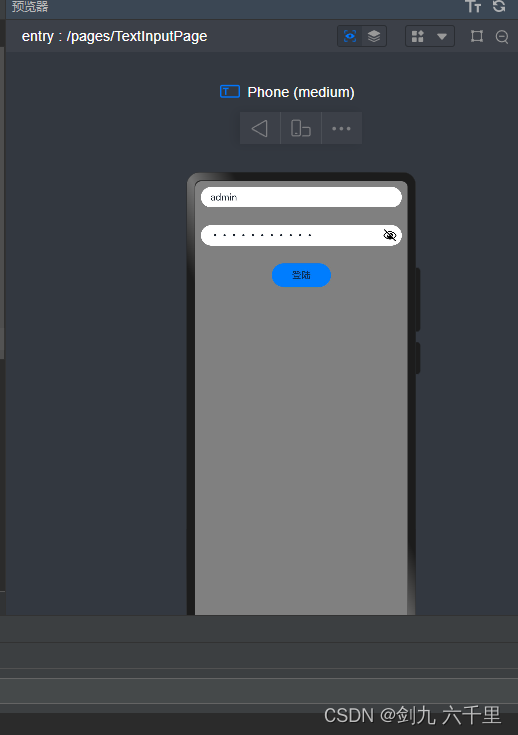
演示了基本的数据声明/数据绑定/事件绑定等:@Entry @Component struct TextInputPage {@State userName: string = ''@State password: string = ''build() {Column({space: 30}) {Row() {TextInput({ placeholder: '请输入用户名', text: 'admin'}).backgroundColor(Color.White).onChange(value => {this.userName = value})}Row() {TextInput({ placeholder: '请输入密码'}).backgroundColor(Color.White).type(InputType.Password).onChange(value => {this.password = value})}Row() {Button() {Text('登陆')}.width(100).height(40).onClick(() => {console.log(this.userName)console.log(this.password)})}}.height('100%').width('100%').backgroundColor(Color.Grey).padding(10)} }点击登录的时候数据已经是响应式的了:

-
模拟登陆校验
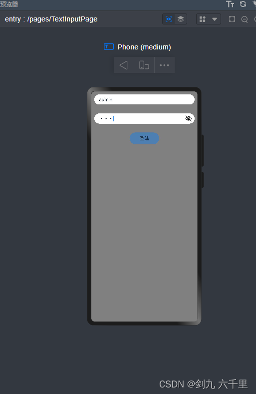
展示了事件的声明及调用,以及一些组合的用法:@Entry @Component struct TextInputPage {@State userName: string = ''@State password: string = ''validate() {return !this.userName || !this.password ? true : false}build() {Column({space: 30}) {Row() {TextInput({ placeholder: '请输入用户名', text: 'admin'}).backgroundColor(Color.White).onChange(value => {this.userName = value})}Row() {TextInput({ placeholder: '请输入密码'}).backgroundColor(Color.White).type(InputType.Password).onChange(value => {this.password = value})}Row() {Button() {Text('登陆')}.width(100).height(40).enabled(this.validate()).onClick(() => {if(this.userName === 'admin' && this.password === 'admin123') {AlertDialog.show({message:"登录成功啦"})} else {AlertDialog.show({message:"登录失败啦"})}})}}.height('100%').width('100%').backgroundColor(Color.Grey).padding(10)} }
3.8 Image 图片组件
3.9 Toggle 切换组件
3.10 Slider 滑块组件
3.11 progress 进度条组件
3.12 Stack 堆叠组件
3.13 Blank 组件
3.14 Divider 分割线组件
3.15 List 列表组件
3.16 Scroll 滚动组件
四、补充:在编辑器中查看组件文档
4.1 DevEco Studio编辑器内查看官方文档
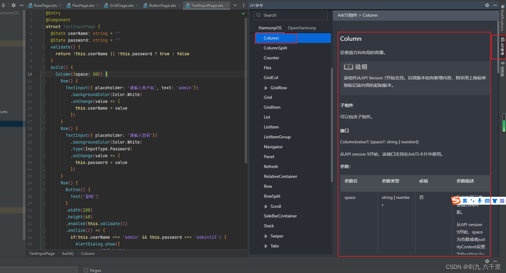
鼠标悬停到组件上,在出来的弹窗中点击查询API参考:
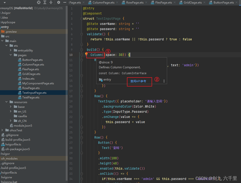
在编辑器右侧可以看到文档的详细信息: