跟着pink老师前端入门教程-day17

2、CSS3 动画
动画(animation)是CSS3中就要有颠覆性的特征之一,可通过设置多个节点来精确控制一个或一组动画,常用来实现复杂的动画效果
相比较过渡,动画可以实现更多变化,更多控制,连续自动播放等效果
2.1 动画的基本使用
制作动画分为两步
1. 先定义动画
2. 再使用(调用)动画
1.1 用keyframes定义动画(类似定义类选择器)
@keyframes 动画名称 {0%{width:100px;}100%{width:200px;}}
1.2 元素调用动画
div {width: 200px;height: 200px;background-color: aqua;margin: 100px auto;/* 调用动画 */animation-name: 动画名称 ;/* 持续时间 */animation-duration: 持续时间 ;}
    <title>用keyframes 定义动画</title><style>/* 想页面一打开,一个盒子就从左边走到右边 *//* 1. 定义动画 */@keyframes move {/* 开始状态 */0% {transform: translateX(px);}/* 结束状态 */100% {transform: translateX(1000px);}}div {width: 200px;height: 200px;background-color: saddlebrown;/* 2.调用动画 *//* 动画名称 */animation-name: move;/* 持续时间 */animation-duration: 2s;}</style>
</head><body><div></div>
</body>
动画序列
0% 是动画的开始,100% 是动画的完成。这样的规则就是动画序列。
在 @keyframes 中规定某项 CSS 样式,就能创建由当前样式逐渐改为新样式的动画效果。
动画是使元素从一种样式逐渐变化为另一种样式的效果。您可以改变任意多的样式任意多的次数
请用百分比来规定变化发生的时间,或用关键词 "from" 和 "to",等同于 0% 和 100%。
    <style>/* from 和 to 等价于0% 和100%  */@keyframes move {from {transform: translate(0, 0);}to {transform: translate(1000px, 0);}}div {width: 100px;height: 100px;background-color: salmon;}</style>
</head><body><div></div>
</body>
HTML
    <title>动画序列</title><style>/* 1、可以做多个状态的变化,keyframe关键词 *//* 里面的百分比不能是整数 */@keyframes move {0% {transform: translate(0, 0);}25% {transform: translate(1000px, 0);}50% {transform: translate(1000px, 500px);}75% {transform: translate(0, 500px);}100% {transform: translate(0, 0);}}div {width: 100px;height: 100px;background-color: salmon;animation: move;animation-duration: 10s;}</style>
</head><body><div></div>
</body>
效果图

2.2 动画常用属性
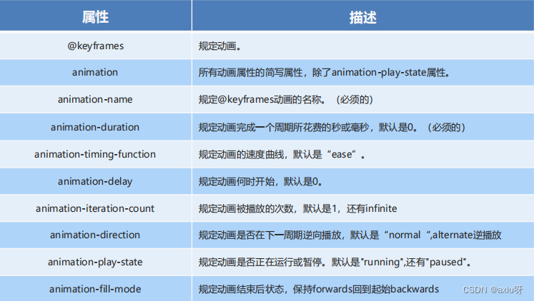
    <title>动画常用属性</title><style>@keyframes move {0% {transform: translate(0, 0);}100% {/* 2.5s时走在这里 */transform: translate(1000px, 0);}}div {width: 200px;height: 200px;background-color: sandybrown;/* 动画名称 */animation-name: move;/* 持续时间 */animation-duration: 2s;/* 运动曲线 */animation-timing-function: ease-in;/* 何时开始 */animation-delay: 0s;/* 重复次数:infinite无限 *//* animation-iteration-count: infinite; *//* 是否反方向播放,默认normal alternate:反方向*//* animation-direction: alternate; *//* 动画结束后状态 默认的是backwards 回到起始状态 可以让他停在结束状态-forward */animation-fill-mode: forwards;}/* 鼠标经过div 让div停止动画,鼠标离开后就继续动画 */div:hover {/* 规定动画是否正在运行或暂停。默认是"running",还有"paused" */animation-play-state: paused;}</style>
</head><body><div></div>
</body>
2.3 动画简写属性
animation:动画名称 持续时间 运动曲线 何时开始 播放次数 是否反方向 动画起始或者结束的状态;
简写属性里面不包含 animation-play-state
暂停动画:animation-play-state: puased; 经常和鼠标经过等其他配合使用
想要动画走回来 ,而不是直接跳回来:animation-direction : alternate
盒子动画结束后,停在结束位置: animation-fill-mode : forwards
    <title>动画简写属性</title><style>@keyframes move {0% {transform: translate(0, 0);}100% {/* 2.5s时走在这里 */transform: translate(1000px, 0);}}/* animation:动画名称 持续时间 运动曲线 何时开始 播放次数 是否反方向 动画起始或者结束的状态; */div {width: 200px;height: 200px;background-color: sandybrown;/* linear匀速 *//* animation: move 2s linear 0s 1 alternate forwards; *//* 前两个属性 name duration 必写 */}</style>
</head><body><div></div>
</body>
2.4 速度曲线细节
animation-timing-function:规定动画的速度曲线,默认是“ease
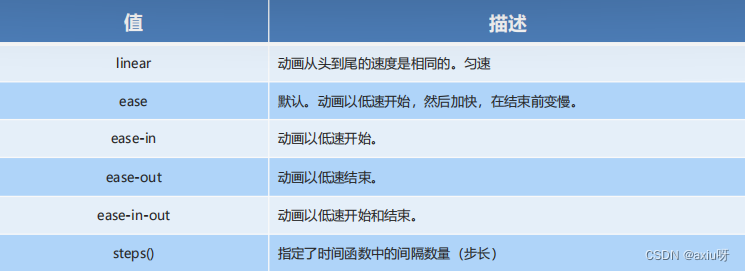
    <title>速度曲线细节</title><style>div {/* 打字机 */font-size: 20px;width: 0;height: 30px;overflow: hidden;/* 让文字强制一行显示 */white-space: nowrap;background-color: saddlebrown;/* steps 就是分几步来完成动画,有了steps 就不用写ease或者linear */animation: w 4s steps(10) forwards;}@keyframes w {0% {width: 0;}100% {width: 200px;}}</style>
</head><body><div>你好呀,我最好的朋友</div>
</body>