纯CSS的华为充电动画,它来了

📢 鸿蒙专栏:想学鸿蒙的,冲
📢 C语言专栏:想学C语言的,冲
📢 VUE专栏:想学VUE的,冲这里
📢 Krpano专栏:想学Krpano的,冲
🔔 上述专栏,都在不定期持续更新中!!!!!!!!!!!!!
文章目录
✨ 关键点
✨ 效果演示
✨ 分析逻辑
✨ 下面附上完整代码

✨ 关键点
拆解一下知识点,最主要的其实是用到了 filter: contrast() 以及 filter: blur() 这两个滤镜,可以很好的实现这种融合效果。
单独将两个滤镜拿出来,它们的作用分别是:
filter: blur(): 给图像设置高斯模糊效果。filter: contrast(): 调整图像的对比度。
但是,当他们“合体”的时候,产生了奇妙的融合现象。
先来看一个简单的例子:

仔细看两圆相交的过程,在边与边接触的时候,会产生一种边界融合的效果,通过对比度滤镜把高斯模糊的模糊边缘给干掉,利用高斯模糊实现融合效果。
✨ 效果演示

✨ 分析逻辑
1、首先我们注意分析,这个效果到底需要怎样的结构去实现
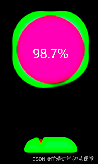
为了更好的看效果 我把所有的元素做了颜色区分,顶部其实就是两个圆利用border-radius去设置了圆角边框的弧度,下面呢?
底部也是一个大圆,其中有很多很多个小圆,因为小圆要向上移动,实现效果,主要的代码如下:
@for $i from 0 through 15 { li:nth-child(#{$i}) {$width: 15 + random(15) + px;left: 15 + random(70) + px;top: 50%;transform: translate(-50%, -50%);width: $width;height: $width;animation: moveToTop #{random(6) + 3}s ease-in-out -#{random(5000)/1000}s infinite;}
}
@keyframes moveToTop {90% {opacity: 1;}100% {opacity: .1;transform: translate(-50%, -180px);}
}
注意:
- CSS本身不支持@for循环,这是一种Sass/SCSS的语法
✨ 下面附上完整代码
HTML:
<div class="g-container"><div class="g-number">98.7%</div><div class="g-contrast"><div class="g-circle"></div><ul class="g-bubbles"><li></li><li></li><li></li><li></li><li></li><li></li><li></li><li></li><li></li><li></li><li></li><li></li><li></li><li></li><li></li></ul></div>
</div>
SCSS
html,
body {width: 100%;height: 100%;display: flex;background: #000;overflow: hidden;
}
.g-number {position: absolute;width: 300px;top: 27%;text-align: center;font-size: 32px;z-index: 10;color: #fff;
}.g-container {position: relative;width: 300px;height: 400px;margin: auto;
}.g-contrast {filter: contrast(10) hue-rotate(0);width: 300px;height: 400px;background-color: #000;overflow: hidden;animation: hueRotate 10s infinite linear;
}.g-circle {position: relative;width: 300px;height: 300px;box-sizing: border-box;filter: blur(8px);&::after {content: "";position: absolute;top: 40%;left: 50%;transform: translate(-50%, -50%) rotate(0);width: 200px;height: 200px;background-color: #00ff6f;border-radius: 42% 38% 62% 49% / 45%;animation: rotate 10s infinite linear;}&::before {content: "";position: absolute;width: 176px;height: 176px;top: 40%;left: 50%;transform: translate(-50%, -50%);border-radius: 50%;background-color: #000;z-index: 10;}
}.g-bubbles {position: absolute;left: 50%;bottom: 0;width: 100px;height: 40px;transform: translate(-50%, 0);border-radius: 100px 100px 0 0;background-color: #00ff6f;filter: blur(5px);
}li {position: absolute;border-radius: 50%;background: #00ff6f;
}@for $i from 0 through 15 { li:nth-child(#{$i}) {$width: 15 + random(15) + px;left: 15 + random(70) + px;top: 50%;transform: translate(-50%, -50%);width: $width;height: $width;animation: moveToTop #{random(6) + 3}s ease-in-out -#{random(5000)/1000}s infinite;}
}@keyframes rotate {50% {border-radius: 45% / 42% 38% 58% 49%;}100% {transform: translate(-50%, -50%) rotate(720deg);}
}@keyframes moveToTop {90% {opacity: 1;}100% {opacity: .1;transform: translate(-50%, -180px);}
}@keyframes hueRotate {100% {filter: contrast(15) hue-rotate(360deg);}
}
注意注意注意:一定要用SCSS!!!!!!!!!!!!
注意注意注意:一定要用SCSS!!!!!!!!!!!!
注意注意注意:一定要用SCSS!!!!!!!!!!!!
我们改日再会