react-webApp--响应式布局

rem响应式布局 移动端响应式布局
1.自己实现,需要设计好初始换算比,设为100px方便计算
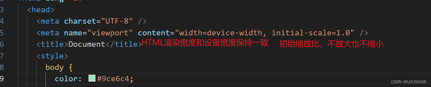
<meta name="viewport" content="width=device-width, initial-scale=1.0, maximum-scale=1.0, minimum-scale=1.0, user-scalable=no"/><!DOCTYPE html>
<html><head><meta charset="UTF-8" /><meta http-equiv="X-UA-Compatible" content="IE=edge" /><metaname="viewport"content="width=device-width, initial-scale=1.0, maximum-scale=1.0, minimum-scale=1.0, user-scalable=no"/><title>REM练习</title><!-- IMPORT CSS --><link rel="stylesheet" href="src/assets/reset.min.css" /><style>/* 实现REM响应式布局开发的步骤@1 找参照的比例(例如设计稿的比例 -> 一般都是750px),在这个比例下,给予html.fontSize一个初始值html {font-size: 100px;// 750PX的设计稿中,我们设置,1REM=100PX// 未来我们需要把从设计稿中测量出来的尺寸(PX单位)转换为REM单位去设置样式}@2 我们需要根据当前设备的宽度,计算相对于设计稿750来讲,缩放的比例;从而让REM的转换比例,也跟着缩放「REM和PX的换算比例一改,则所有之前以REM为单位的样式也会跟着缩放」;@3 我们一般还会给页面设置最大宽度「750px」,超过这个宽度,不再让REM比例继续变大了;内容居中,左右两边空出来即可!!*/html {font-size: 100px;}html,body {height: 100%;background: #f4f4f4;}#root {margin: 0 auto;max-width: 750px;height: 100%;background: #fff;}.box {width: 3.28rem;height: 1.64rem;line-height: 1.64rem;text-align: center;font-size: 0.4rem;background: lightblue;}</style><script>/* 计算当前设备下,REM和PX的换算比例 */;(function () {const computed = () => {let html = document.documentElementconsole.log(html);(deviceW = html.clientWidth), (designW = 750)if (deviceW >= designW) {html.style.fontSize = '100px'return}// 计算比例// 750 /100=deviceW/?// ?=deviceW/(750 /100)//?=deviceW*100/750let ratio = (deviceW * 100) / designWhtml.style.fontSize = ratio + 'px'}computed()window.addEventListener('resize', computed)})()</script></head><body><div id="root"><div class="box">珠峰培训</div></div></body>
</html>
原理: 找参照的比例,就是html里font-size的改变
+ 2.react
配置REM响应式布局的处理:lib-flexible、postcss-pxtorem 插件
lib-flexible 设置REM和PX换算比例的
+ 根据设备宽度的变化自动计算
+ html.style.fontSize=设备的宽度/10+'px';
+ 750设计稿中 1REM=75PX : 初始换算比例
+ 375设备上 1REM=37.5PX
postcss-pxtorem 可以把我们写的PX单位,按照当时的换算比例,自动转换为REM,不需要我们自己算了
----
@1 假设设计稿还是750的,我们测出来多少尺寸,我们写样式的时候,就写多少尺寸,并且不需要手动转换为REM「我们在webpack中,针对postcss-pxtorem做配置,让插件帮我们自动转换」
const px2rem = require('postcss-pxtorem');
px2rem({
rootValue: 75, // 基于lib-flexible,750设计稿,就会设置为1REM=75PX;此时在webpack编译的时候,我们也需要让px2rem插件,按照1REM=75PX,把我们测出来的并且编写的PX样式,自动转换为REM;
propList: ['*'] // 对所有文件中的样式都生效{AntdMobile组件库中的样式}
})
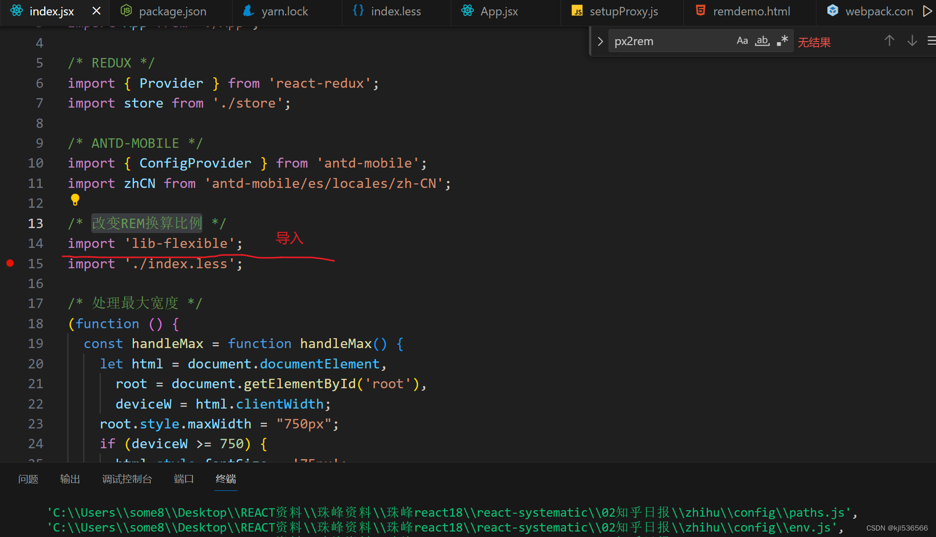
@2 在入口(index.jsx)中,我们导入lib-flexible,确保在不同的设备上,可以等比例的对REM的换算比例进行缩放!!
@3 手动设置:设备宽度超过750PX后,不再继续放大!!
@1

@2

index.jsx
import React from 'react';
import ReactDOM from 'react-dom/client';
import App from './App';/* REDUX */
import { Provider } from 'react-redux';
import store from './store';/* ANTD-MOBILE */
import { ConfigProvider } from 'antd-mobile';
import zhCN from 'antd-mobile/es/locales/zh-CN';/* 改变REM换算比例 */
import 'lib-flexible';
import './index.less';/* 处理最大宽度 */
(function () {const handleMax = function handleMax() {let html = document.documentElement,root = document.getElementById('root'),deviceW = html.clientWidth;root.style.maxWidth = "750px";if (deviceW >= 750) {// 屏幕宽度超750,不改变保持75pxhtml.style.fontSize = '75px';}};handleMax();
})();const root = ReactDOM.createRoot(document.getElementById('root'));
root.render(<ConfigProvider locale={zhCN}><Provider store={store}><App /></Provider></ConfigProvider>
);