uniapp自定义进度条组件

目标效果
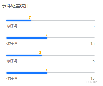
原型设计为这样的样式,但是现有的进度条组件样式都无法满足需求,于是编写组件实现。
设计引用格式为
<zLineProgress :total="15" :val="7" title="你好吗" />
定义组件
<template><view style="height: 3.5rem; margin: 0 1em;"><view class="line-total" :style="'width: ' + (val / total * 100) + '%'">{{val}}</view><view style="position: relative;">			<view class="line-base"></view><view class="line-blue" :style="'width: ' + (val / total * 100) + '%'"></view></view><view class="line-val"><text>{{title}}</text><text>{{total}}</text></view></view>
</template><script>
export default {name: 'zLineProgress',data() {return {}},props: {// 标题title: {type: [String, Number],default: ''},total: {type: [Number],default: 0},val: {type: [Number],default: 0}},computed: {},methods: {}
}
</script><style scoped>
.line-total {color: #FFB000;text-align: right;font-size: 25rpx;font-style: normal;font-weight: 700;line-height: normal;
}
.line-base {position: absolute;width: 100%;height: 3px;border-radius: 8px;background: rgba(128, 136, 142, 0.40);
}
.line-blue {position: absolute;width: 50%;height: 4px;border-radius: 8px;background: #1677FF;box-shadow: 0px 0px 4px 0px rgba(22, 119, 255, 0.50);
}
.line-val {display: flex;justify-content: space-between;color: #7e7e7e;font-size: 25rpx;font-weight: 50px;margin-top: 12rpx;
}
</style>
页面导入
import zLineProgress from '../../uni_modules/z-line-progress.vue'
配置组件声明
components: {"zLineProgress": zLineProgress
},
然后如本文开头所示使用即可